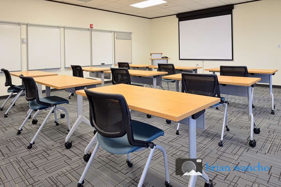
The United Way of El Paso County recently moved into new offices in the Stanton Tower in downtown El Paso. Their new offices were designed to make maximum use of natural light in an effort to create a productive work environment.
HON Office Furniture selected the United Way’s new offices to be featured in a case study. I was hired to capture photographs of the workspaces to be featured in the case study.
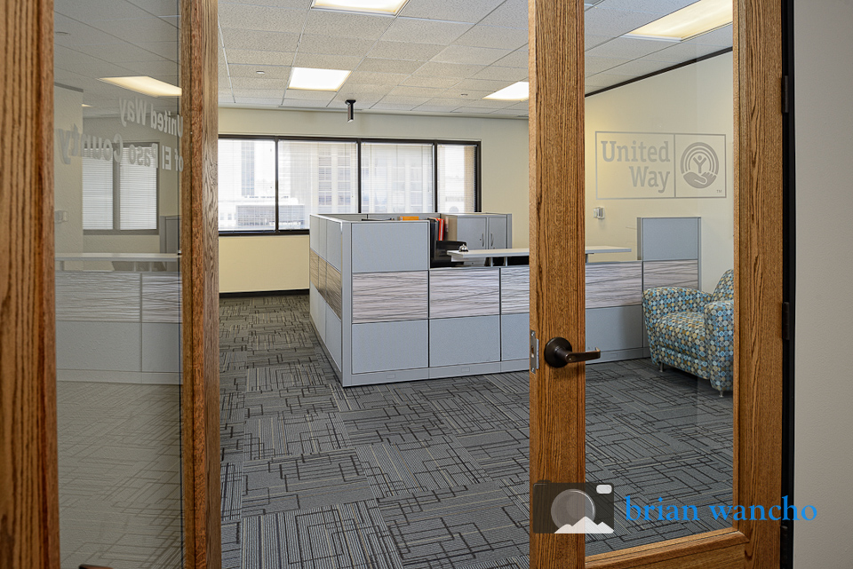
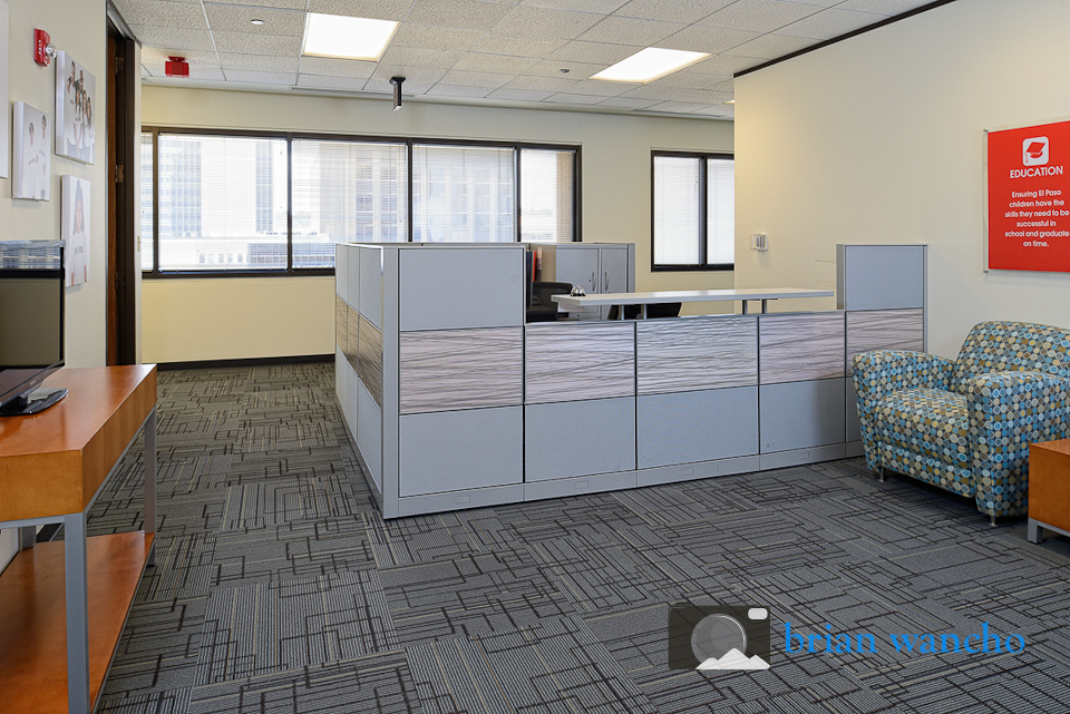
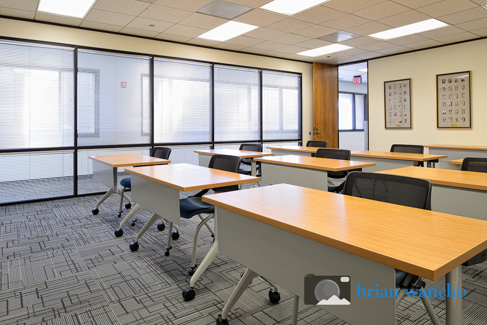
One of the main themes of the case study will be to contrast the dark, unproductive space at the prior location with the abundance of natural light that fills the new office. To support that theme, many of the photos were composed to include the windows. This presents an exposure challenge. In most cases, a photo that is well exposed for the light coming through an exterior window will be significantly underexposed in the interior space.
To compensate, I set-up multiple off camera flashes to light the interior space make it closer to the brightness coming through the windows. Below is a view from the opposite direction as the photo above.
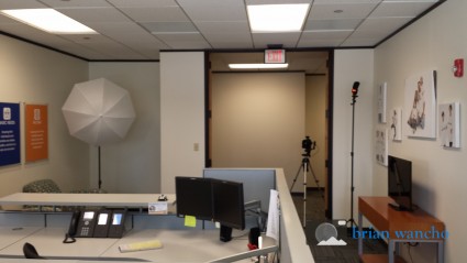
The photo above shows two primary methods of lighting a room using flashes. Bouncing the flash off the “wall-wall-ceiling joint” or using an umbrella help prevent hard shadows in the captured image.
Wireless Tethering and Remote Creative Direction
One unique aspect of this project is that the client was not able to be on site but still wanted to review the images as they were being captured. Because I use a CamRanger system which wirelessly connects my iPad to my camera, it was a simple additional step to email the captured images to my remote creative director.
Using Perspective Control
As a professional architecture photographer, one thing that sets me apart from other photographers who don’t specialize in architecture is my use of specialized equipment such as my Nikkor 24mm PC-E (tilt/shift) lens. This lens allows me to precisely control the perspective of an image. For an image like the one below, I was able to maintain a high point of view to see over the cubicle walls and also shift the lens down to capture a good balance of floor and ceiling. You can read more about my use of this lens in my blog post about attention to detail in real estate photography.
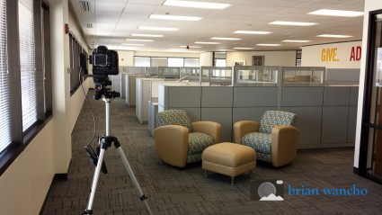
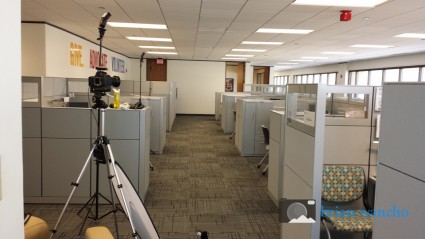
Here is the view from behind the camera. Note how high the camera is on the tripod yet the image above still includes the furniture in the foreground.
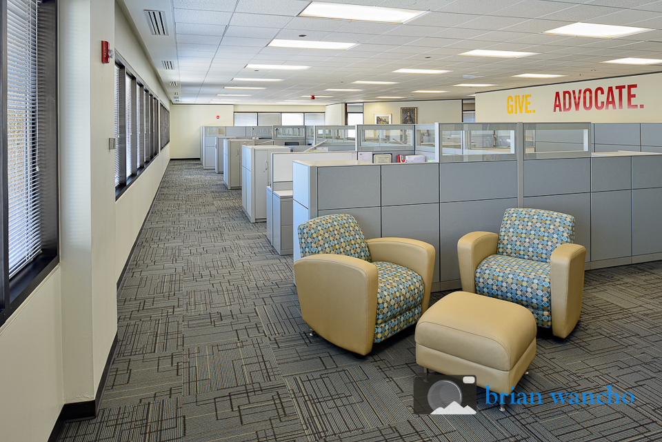
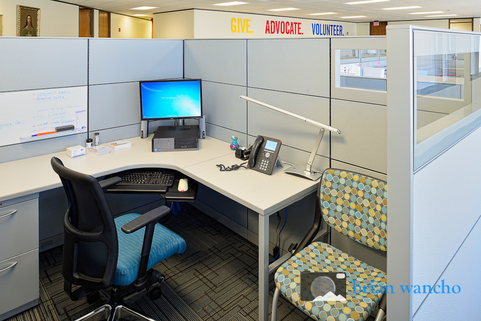
Below is another, more extreme example. Using the perspective control lens I was able to set the camera height so that the slogan was visible above the cubicle wall. After that point of view was set, I was able to shift the lens down to compose the image to include the entire workspace. This is not possible with standard lenses.
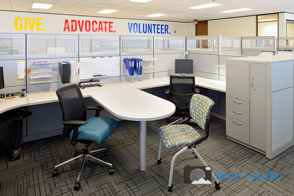
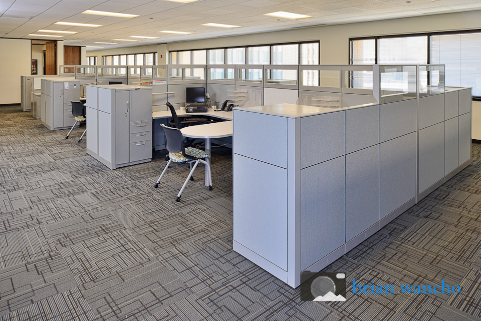
The photo above presented the same challenge as the reception area. In order to get the interior properly exposed while maintaining the detail in the windows, a lot of off camera flash was required.
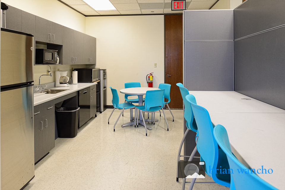
The final few images show the conference room and break room. The goal with these images was to continue to support the theme of a productive environment full of natural light.
